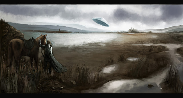
Over these last few weeks I've really focused on pushing skills further, pushing past boundaries and doing different things. This is a rough, 'speed' painting/sketch, forcing myself to use a very limited palette range that I'm unaccustomed in using. I was tempted every step of the way to put more color into it but I wanted that 'realism' aspect of a cold morbid landscape in the image. The subject matter is from one of my current projects. It shows the strange contrast of a medieval time period and alien visitation. I guess what I like about the image is that feeling of 'out of placeness' whilst being seemingly normal. Looking at the image I see tons of things I want to change but I want it to stay loose and to just convey the concept rather than be polished into a fully developed illustration. Hopefully I'll have time to post up a few environment concepts and some more character concepts next.
ALL ARTWORK AND TEXT COPYRIGHT © CIRO CORREIA, UNLESS OTHERWISE ATTRIBUTED TO THE RESPECTIVE COPYRIGHT OWNER - IT IS ILLEGAL TO PUBLISH OR PRINT ANY SUCH ARTWORK OR TEXT WITHOUT WRITTEN PERMISSION BY THE ARTIST.
Sunday, 18 September 2011
Sunday, 11 September 2011
Friday, 9 September 2011
The Magician's Daughter - process
Here are some of the 'WORK IN PROGRESS' shots. The first one is just the initial 20 min sketch. The ADHD part of me just wanted to start painting already but lately i've been working on discipline and adding value to my process so I continued the rough sketch into a clearer sketched out picture of what was in my head. Greater detail in the sketch phase makes sense, since clients and supervisors can't see what is in your head or make sense of extremely rough lines. This is a personal piece so If I were doing it for review or approval I would have taken it a lot further and refined more but by the time I got to this point I was just itching to get it done already! So I wanted composition clear, some sense of the values in the painting, approximately accurate sketch of the final.
The next image shows the image after blocking out color areas and having begun painting in areas after I decided on the color palette. I wanted the palette to be similar to Waterhouse's painting in my study.
The third image is just before I begin polishing some of the surfaces (mainly focal points) and adding in edges, etc.
I just recently received some good feedback from a fellow artist on WIPNation about composition and some individual elements, which I appreciate. I will probably tune the image at a later date after a short break. In the meanwhile here is an alternate cooler color version.
Subscribe to:
Posts (Atom)


